Below is two final animations for the animation studio, Curveball Media.
This is a group project working for the animation studio Curveball. We are creating two short animations to promote their company.
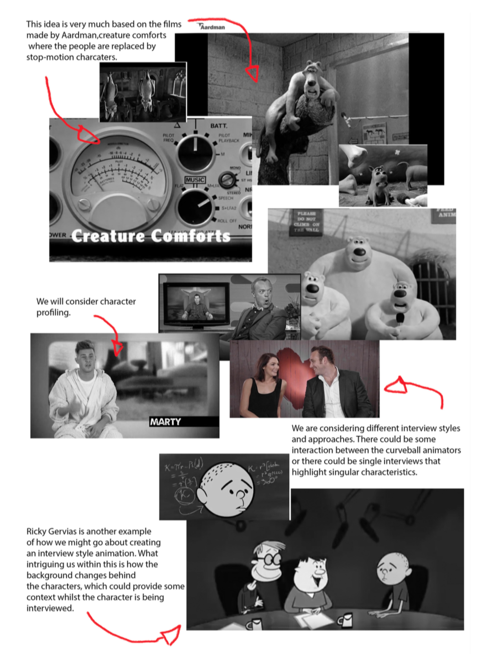
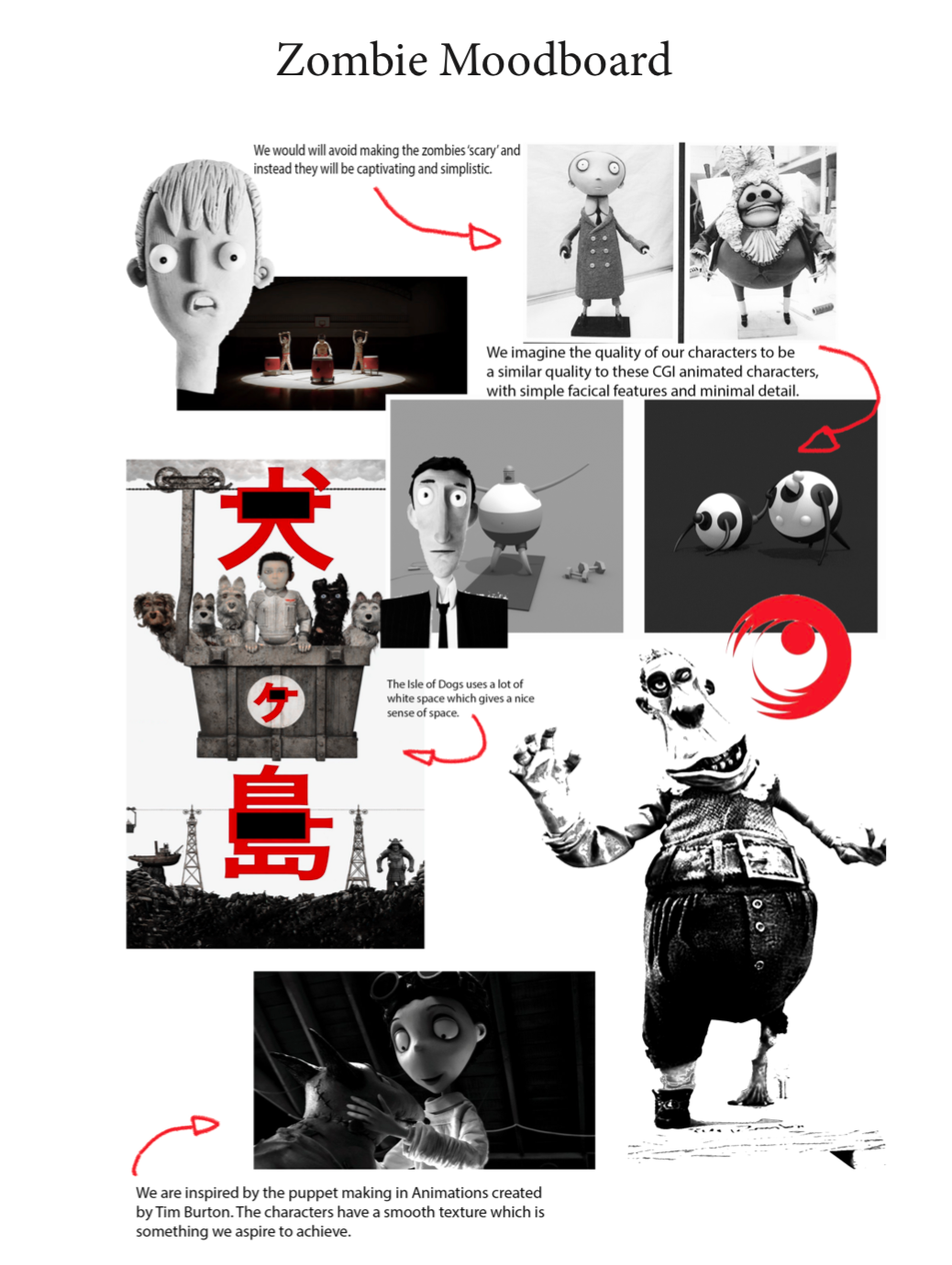
I made three mood boards of research that inspired us and give the same visual qualities that we are looking for.

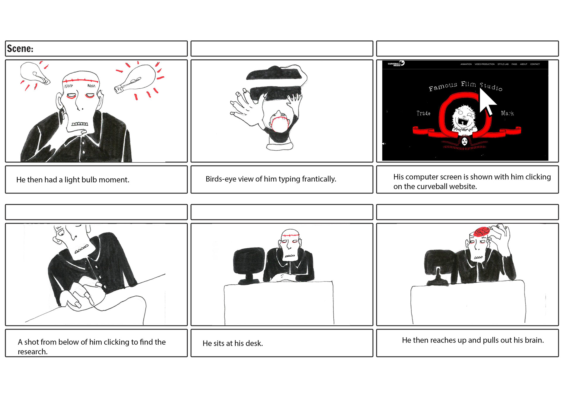
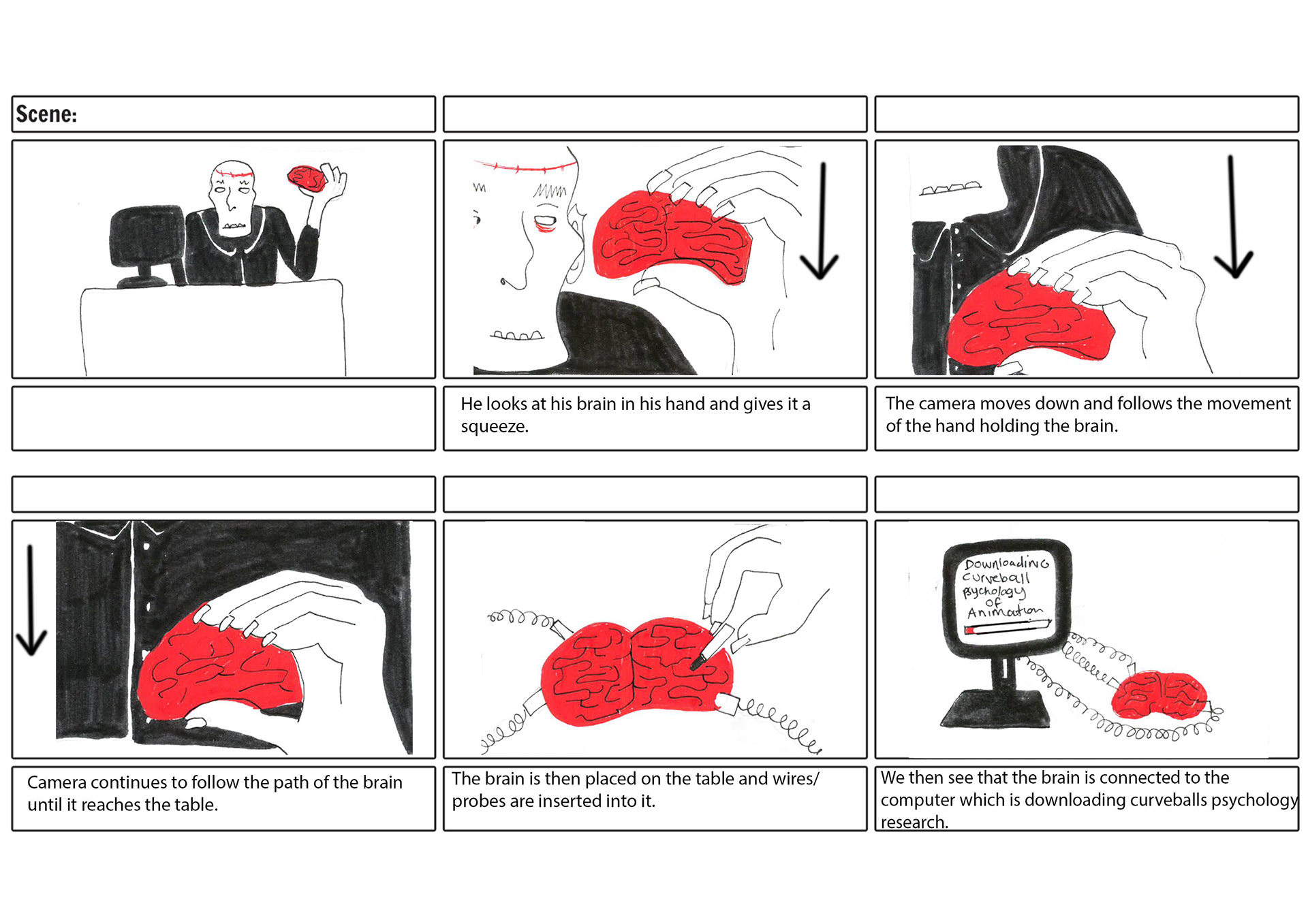
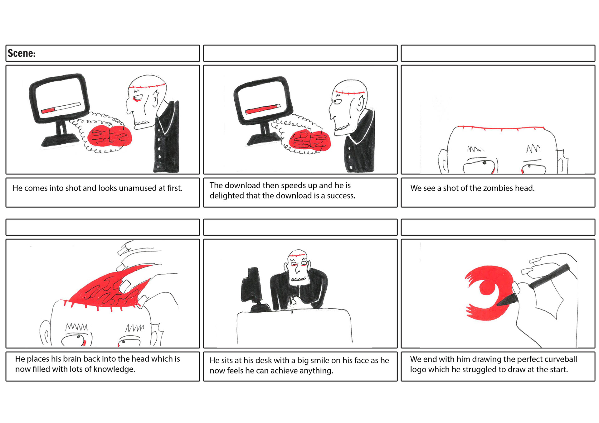
The team each made their own storyboard based on the idea of a zombie in an office environment. This is my storyboard and it is based on the idea of the zombie who downloads the curveball research onto his brain and this means that he can then solve problems easier now and he is happy with his new knowledgeable working approach!
This is an animatic for our zombie idea, we have come to conclusions on how we want our character to move and the timings/shots of the animation.
We pitched to Curveball and they seemed excited by the Zombie idea. They said that they liked my story idea of the zombie downloading their research and so we are going to go forward with this character and idea. They also said they liked how the zombie in my storyboard looked friendly/funny so I then went on to try to design a zombie with these same qualities.
Character Design
After talking to Curveball and hearing their feedback we have decided that I would design the zombie. I sketched out a lot of different faces and then I left it down to Margaret and Jordan to choose which one they liked best. They chose the one that was actually closest to my original character within the first storyboard so we thought this would be a good place to start.
Margaret developed the Zombie into a character turnaround, which looks really great and gives us a clear idea of how the zombie will look as a puppet. Now that we have our character we could work on finalising the storyboard.
Finalised storyboard
Here we worked together to think about the different shots within the animation. I drew out different camera angles that we thought would work best. Jordan was very helpful with the directing of this storyboard and provided some good insights into the order and structure.

Concept Art
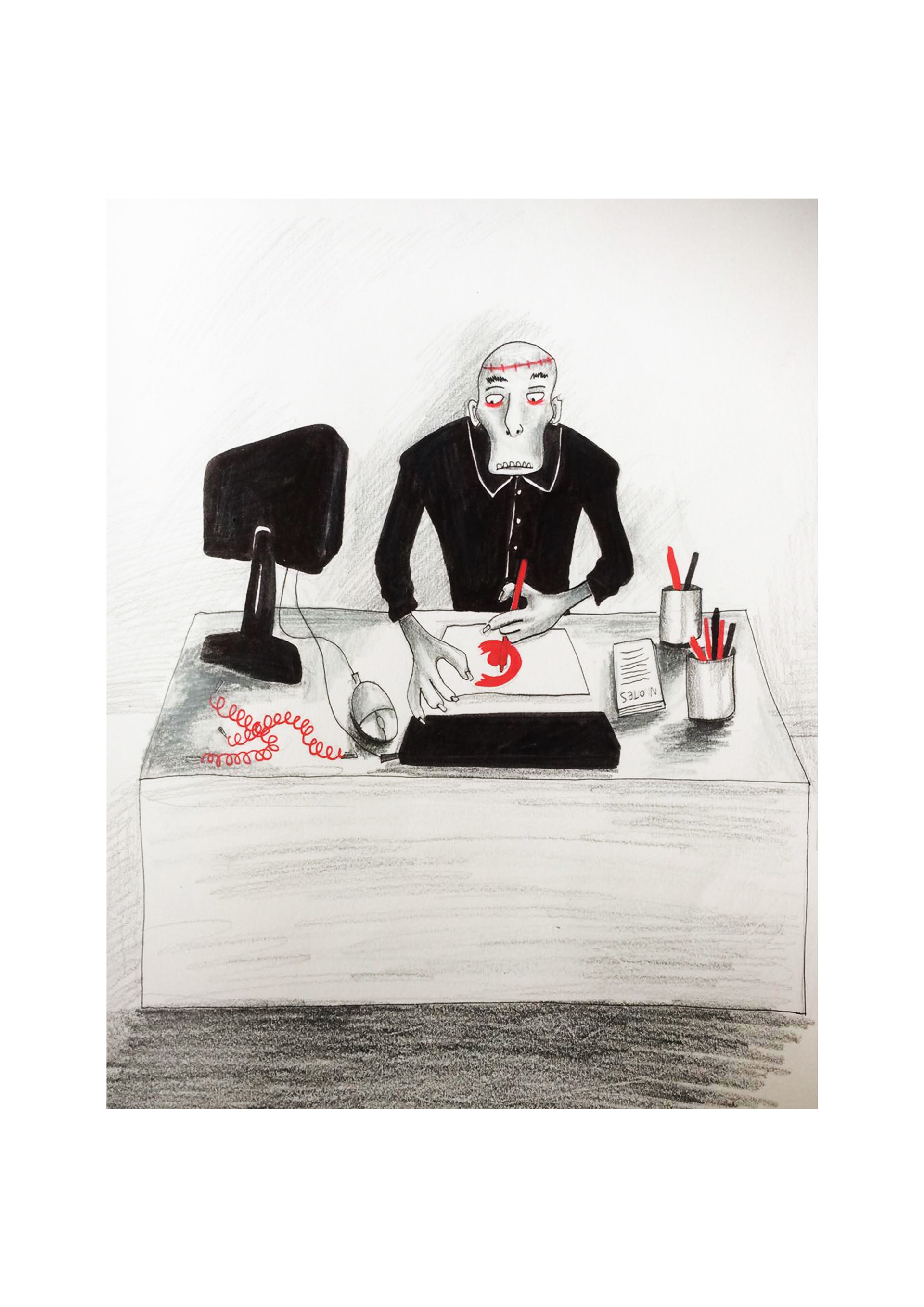
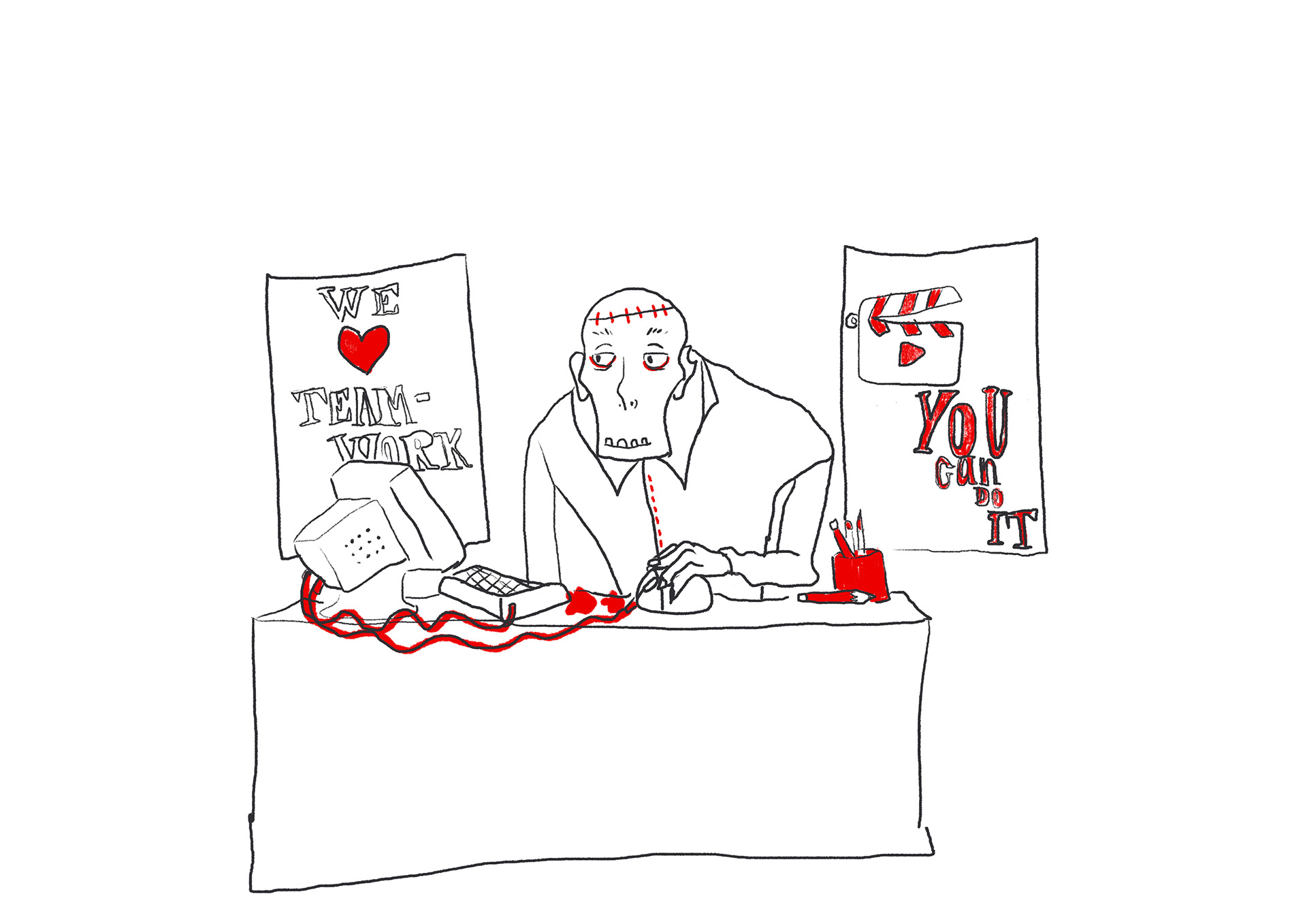
I made the concept art on the left which has the main elements which we will include within the animation. I then developed this and made a digital version which represents the more graphic clean appearance that we will create within the animation style. I have been thinking about the design of the set and I thought I would keep it fairly minimal with some graphic design posters of funny cheesy workplace posters so that the space is not too empty. I will make these out of paper and hand draw them to keep the hand-made feel it will have.
At this point we had created our storyboard and concept art and we were able to go and present to Curveball. I put together the presentation to show them. At this point we are unsure exactly what visuals we will include within the animation but it will become clearer once we have the sound recordings.
Edit: Whilst we were in Norwich we recorded the interviews for our second animation and so we could then start to think about what kind of things we could include. However our main focus was still on finishing the Zombie animation as we are focusing on one at a time so that we are focused.
The Set
I visited to wood workshop where I made a wooden set which has removable walls by unscrewing them, so that I could ensure that we can film the puppet from all angles according to the storyboard. I also made the table and chair from wood so that they were stable and strong and would not move around.
I painted the set white to keep it looking fresh and minimal and to keep within the colour scheme of white, red and black.
I had a lot of fun creating the props and objects to go within the set, I sculpted them out of a modelling clay called super sculpt which I then painted. I made sure to glue the objects that didn't need to move to the table so that we did not knock them when we animated.
I also designed little posters with comical workplace motivational messages on them so that the space felt like an office but with a humorous twist and these details can make all of the difference within an animation.
I am really happy with how the set has turned out and I think that the puppet will work well within it.
We have been meeting up to animate on the scenes. After the presentation in Norwich we changed some elements of our animation slightly so that the narrative made more sense. We needed to have a problem that would be clear to the viewer so we changed the drawing idea to the puzzle idea. This change has meant that I will need to make some larger hands and a larger puzzle so that it will be easier and better quality to animate with- as the hands on the puppet are very small.
This is an image of the larger hands and I puzzle that I made. Jordan assisted me in the filming of this shot. We animated this using dragonframe and the camera which was above. This did however mean that the lighting for our animation was different so Jordan needed to spend a lot of time editing this end shot so that it has the same colouring as the rest as the lighting in this room was very warm/yellow compared to out other white saturated scenes.
Final Animation
We worked quickly to get the animation done in time to have time to plan out the other animation after this one. Margaret added on hand drawn sparks onto the brain so that it was clear that it was connected to the computer and downloading something. I am very happy with the outcome of this animation because I feel that we have created what we set out to achieve.
Moving Onto the Next Animation-
Interview Animation
I began designing characters before I met the Curveball animators. We knew that we wanted to use their colours and also do digital drawings using photoshop. Margaret designed some characters which were based on one of the first ideas we had at the start based on the idea of teamwork. She then used these characters and adapted them into the curveball colours. I then digitalised them to see what they would look like and they didn't look as good as when they were hand-drawn in Margarets sketchbook. I then played around with them and created a more simple silhouette look. I thought this would be easier to animate with and we could focus more on the movements and it has a nice textured appearance.
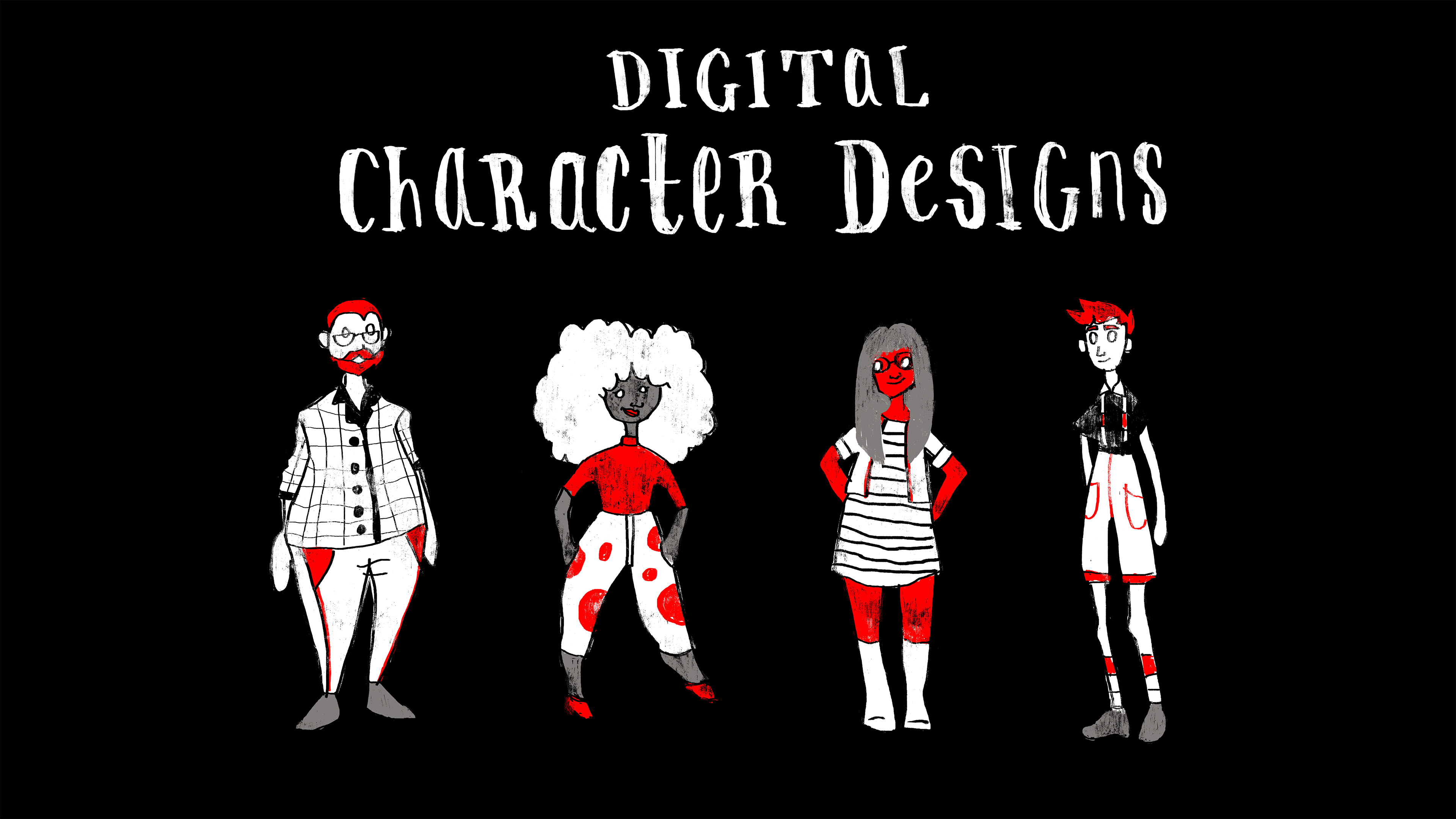
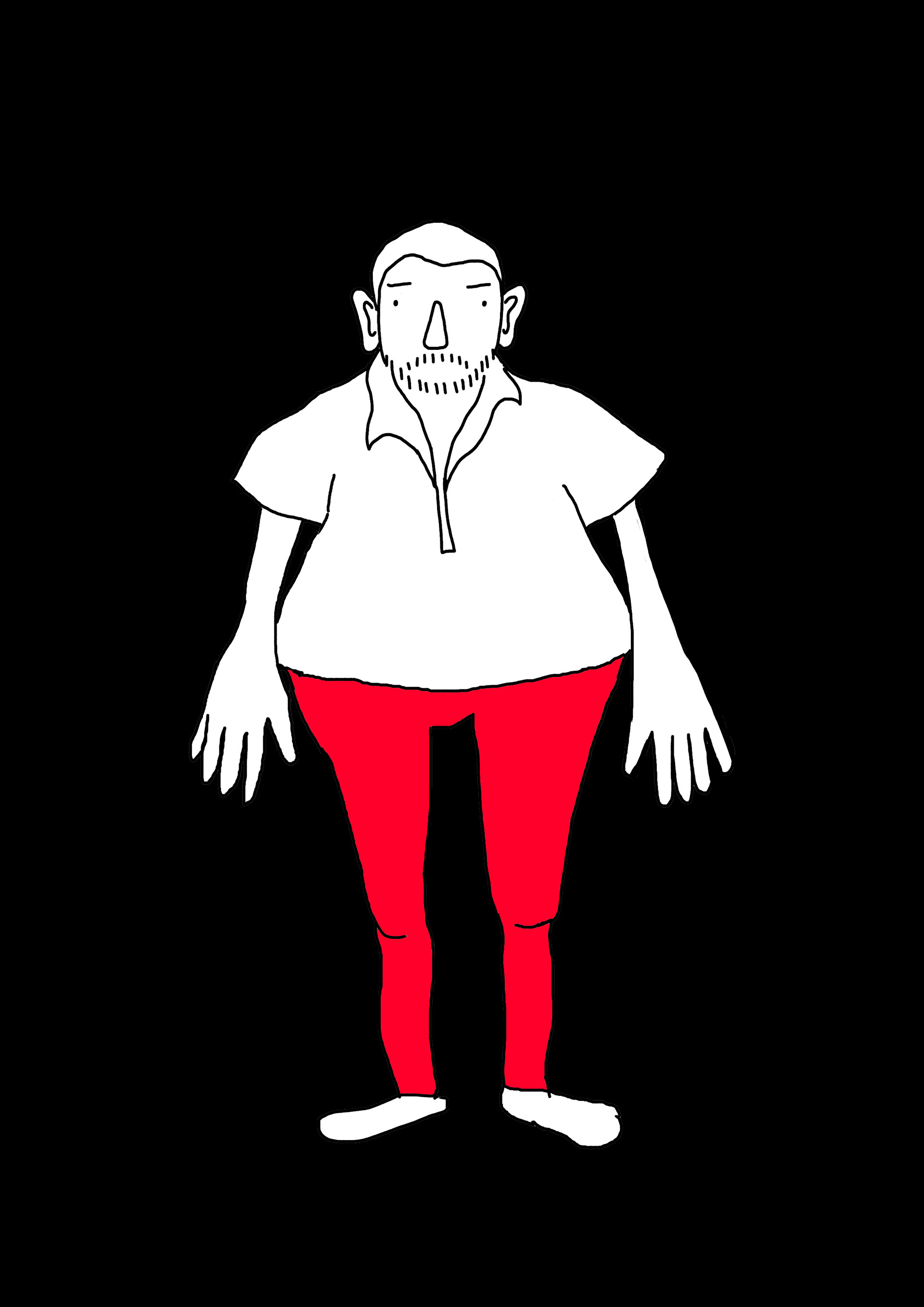
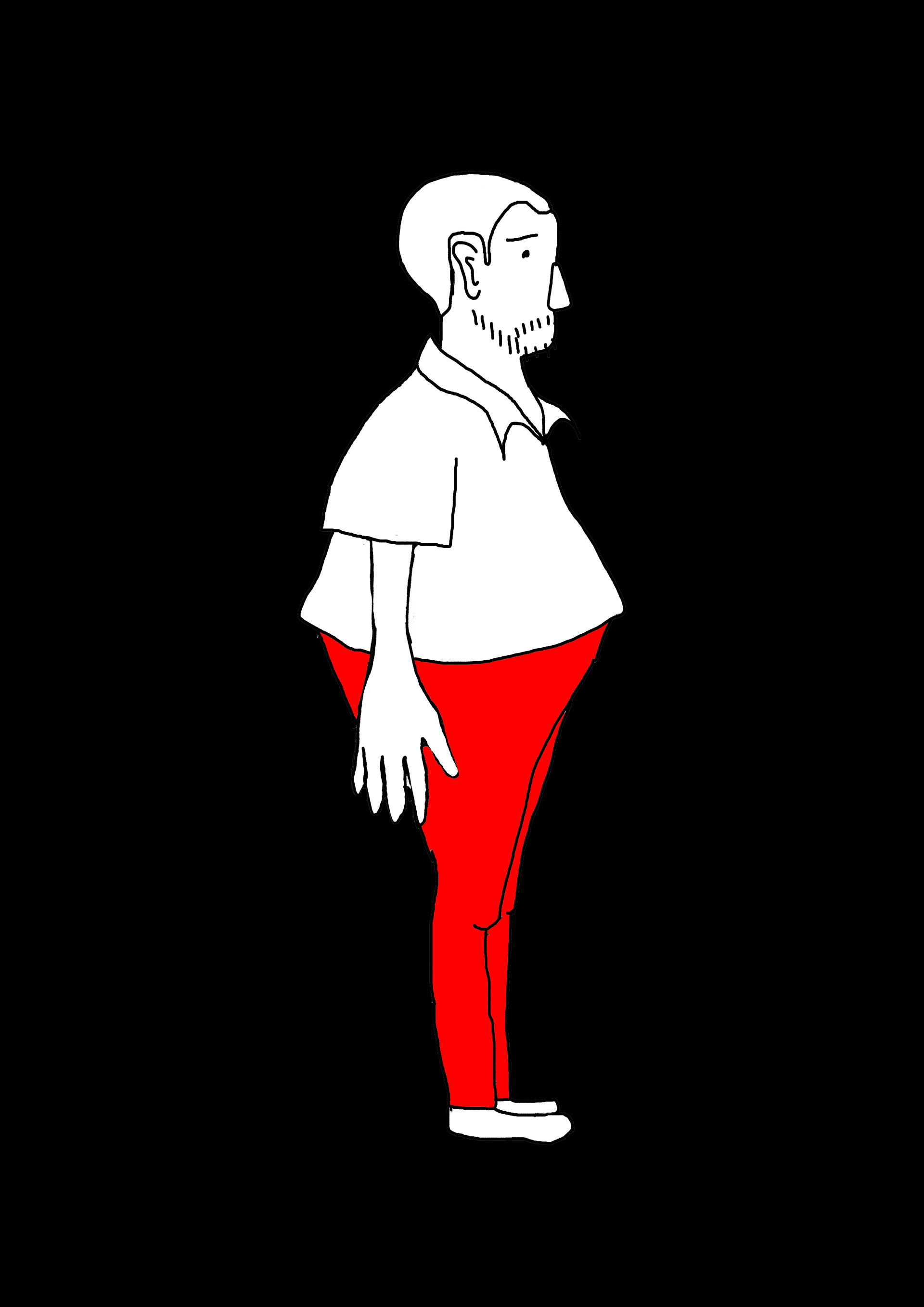
These are the final character designs for the animation.
Concept Art
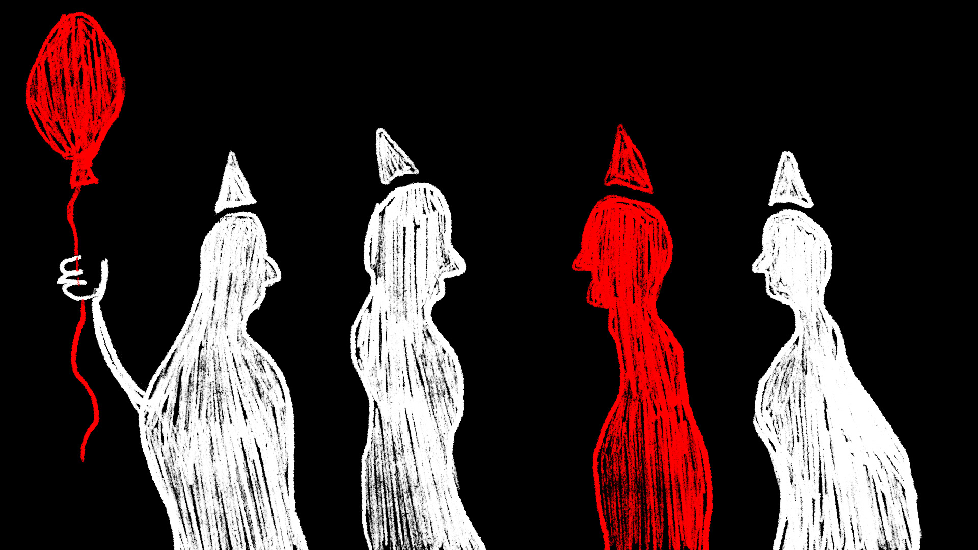
Here is some concept art that I made to get an idea of the visual quality that we would like within the animation.
I had an idea for the second part of the animation which was based around being invited to a party. The interview for the second man consisted of him talking about how the client is involved with everything they do, every step and stage. Therefore I thought it would be fun to revolve the animation around this idea of having the client being invited and there for all of the fun. The client would be in red and the curveball team in white so that you can tell that there is a client and lots of engagement with the curveball team. I liked the idea of using blocked shapes that move fluidly to give the sense of fun.
I thought that it would work to animate something slightly different to what they are saying so that it is more engaging.
In the end, the team decided that they would like to take their own direction for this part of the animation which worked well.
I did however use my concept of this boat sailing through.


Storyboarding
As we had split the animation into three parts, it was my part to do the first 15 seconds. I needed to keep the visuals fairly similar to what the interviewee was saying so that the viewer is able to settle into the animation.
I also came up with the idea of using the voice waveforms so that we can use this as a transition from one person to another.
For my part I will keep it very fluid and I want to include some morphing transitions with lots of frames so that it is nice and smooth but also have a textured and raw feel to it.
Type For the Credits and the Title
Animatic
This is an animatic for the first part of my 15 seconds. As we each had different people to animate from the interview we made separate animatics to show each other and to check if they would work together. I showed this animatic to my team and they were happy with it.
I have changed some parts of my animation part so that it is better timed to the speech. I decided to add in the part about the cliche rather than the big company part so that it was less intimidating on the screen and I found a nice way to transition from the waves to the clicks hands.
The Animated Parts I created:
Final animation
