Final Animation
This is the final animation. Overall, I feel as though I could have made this animation more professional and I could have done better movements. The animation was very ambitious within the timescale and I struggled to keep up! I spent a lot of time created the puppets and the set and so this did not allow much time for the actual animating. I think that I did however create a good story.
I decided to use a shortened width ratio to match films within the 40's that had a smaller ratio compared to now. I wanted the animation to have a vintage feel to it.
When I presented my animation to the class I got some laughs and giggles which is really great and what I wanted to achieve for this animation.
Below you can view the working process.
Research
I began the Project researching into similar stop-motion animations and short films. I also looked into historical figures and set designs within film. I created a mood-board of animations stills and historical artefacts which have the sense of atmosphere and mystery that I desire to accomplish. I knew that the setting for the animation would be within a Prison so this was my starting point.
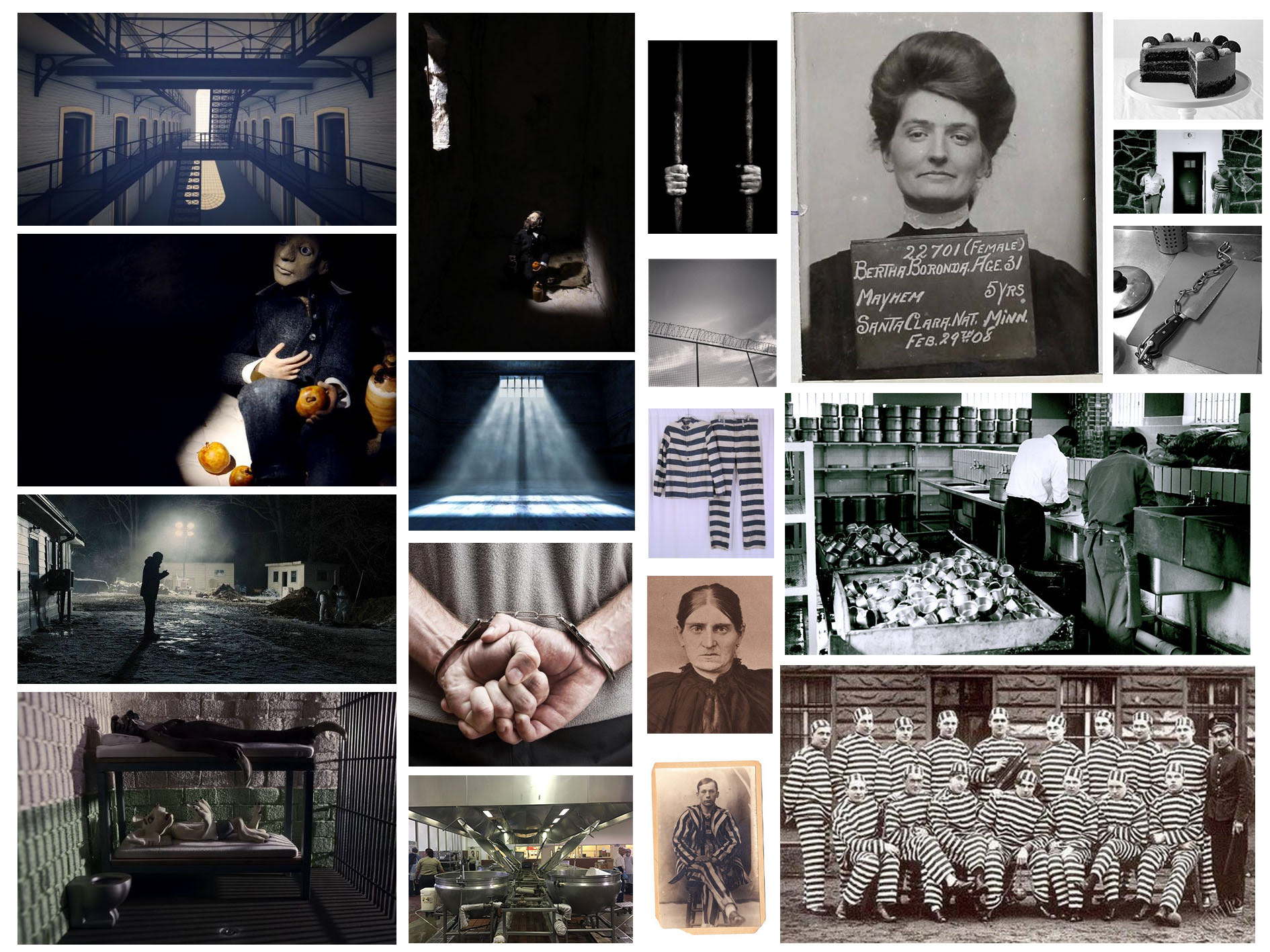
A mood board to capture the sense of atmosphere I wish to create
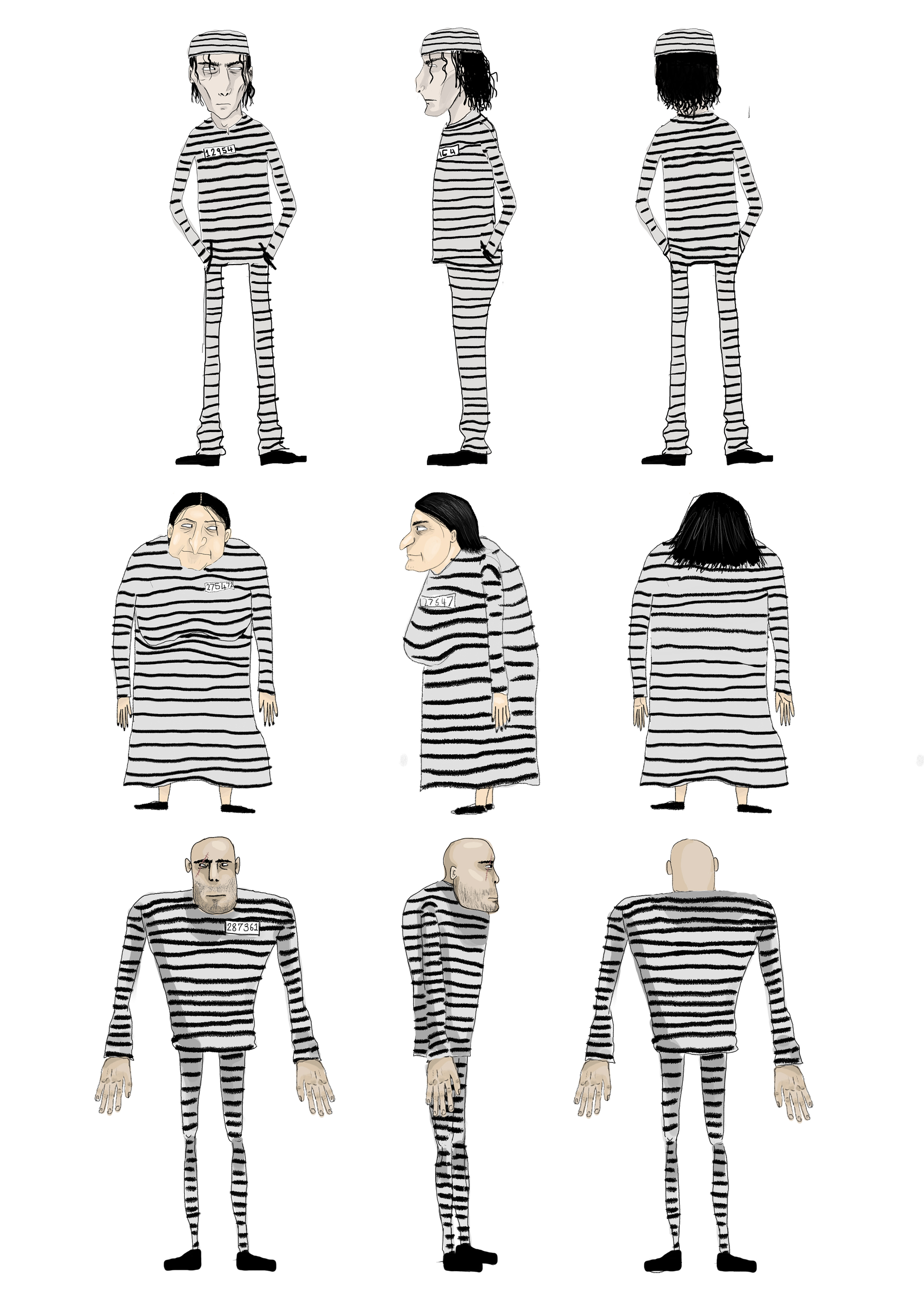
Character Designs/Turnarounds
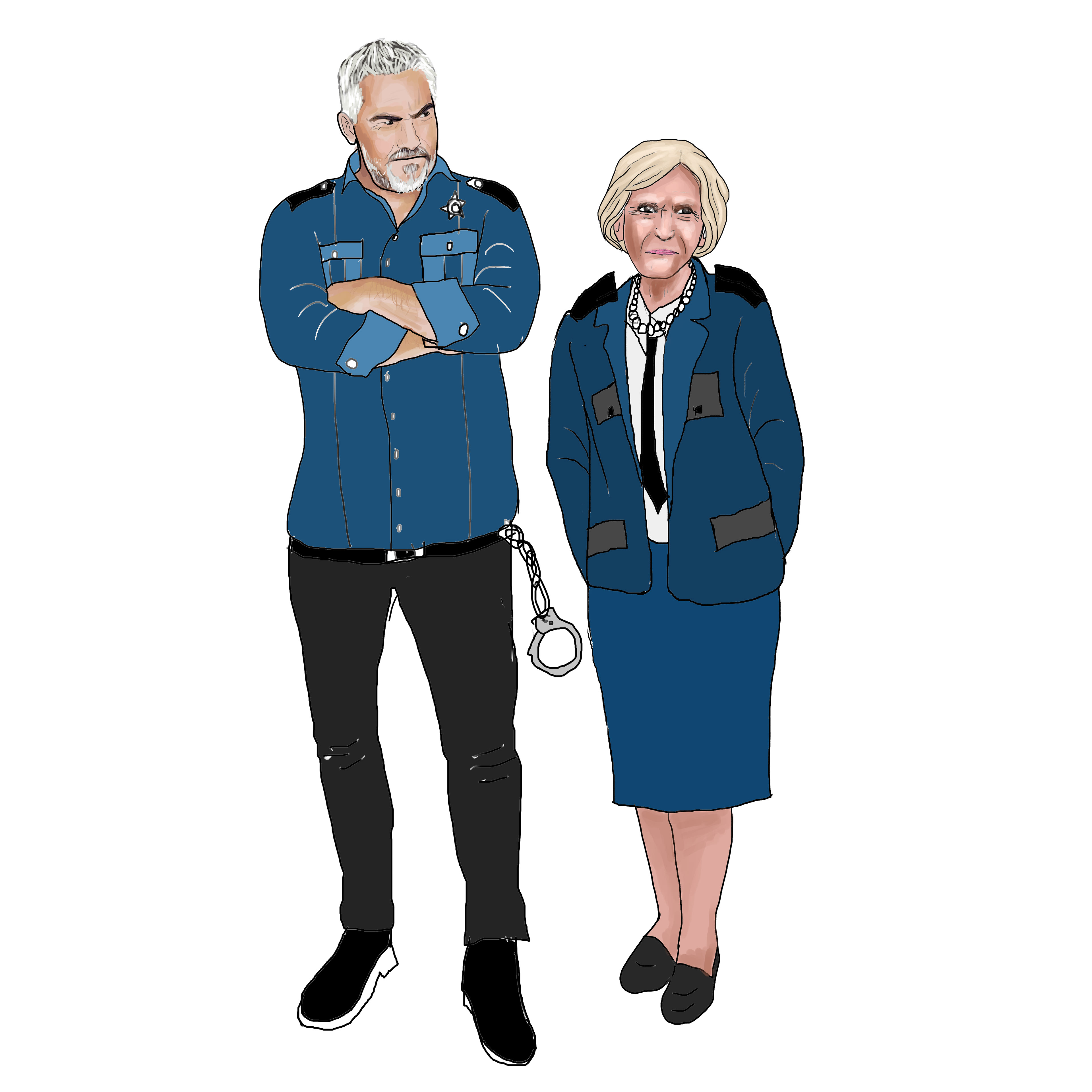
Drawing of Mary and Paul characters
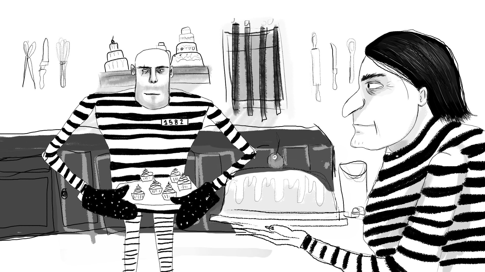
Concept art for the animation.
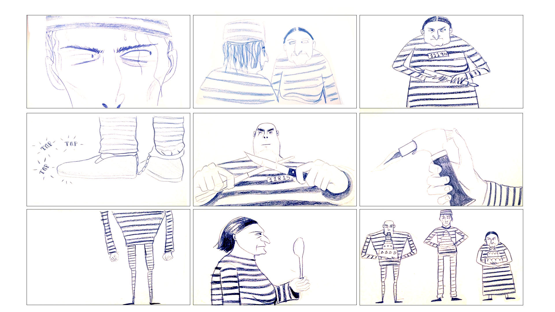
A storyboard planning the main scenes.
Character Design
I could distinctly imagine the kind of characters I wanted to design and I really enjoyed this process. I want to have characters with different body shapes but also have a less typical scary prisoner appearance, I wanted them to look softer and friendlier. I think that the puppets I created were very similar to my designs so I am happy with that.
Concept Art
I wanted to create a very simple set in which you get a sense of being in a prison without building a huge set. I want to have simple props and small clues to slowly reveal the setting. The concept art is based on the characters baking for the big competition and this could be when the baking part is revealed.
Storyboard
The storyboard above was an initial storyboard that I did to place the main scenes of the animation and to get a rough structure of the shots. I then developed this further into a more accurate storyboard for the narrative. I was really excited about the storytelling elements of this animation because I found it to be humorous and compelling.
The Set
I created a simple set with a wooden Frame and I painted this with a metallic silver paint to give it some texture when lit. I shot most of the scenes within the same set but I used different angles so that it appeared as if they were in slightly different areas.
I also created a window in which I placed over the previous set. I added bars so that you can get a feel that the prisoners who didn't win are stuck in prison.
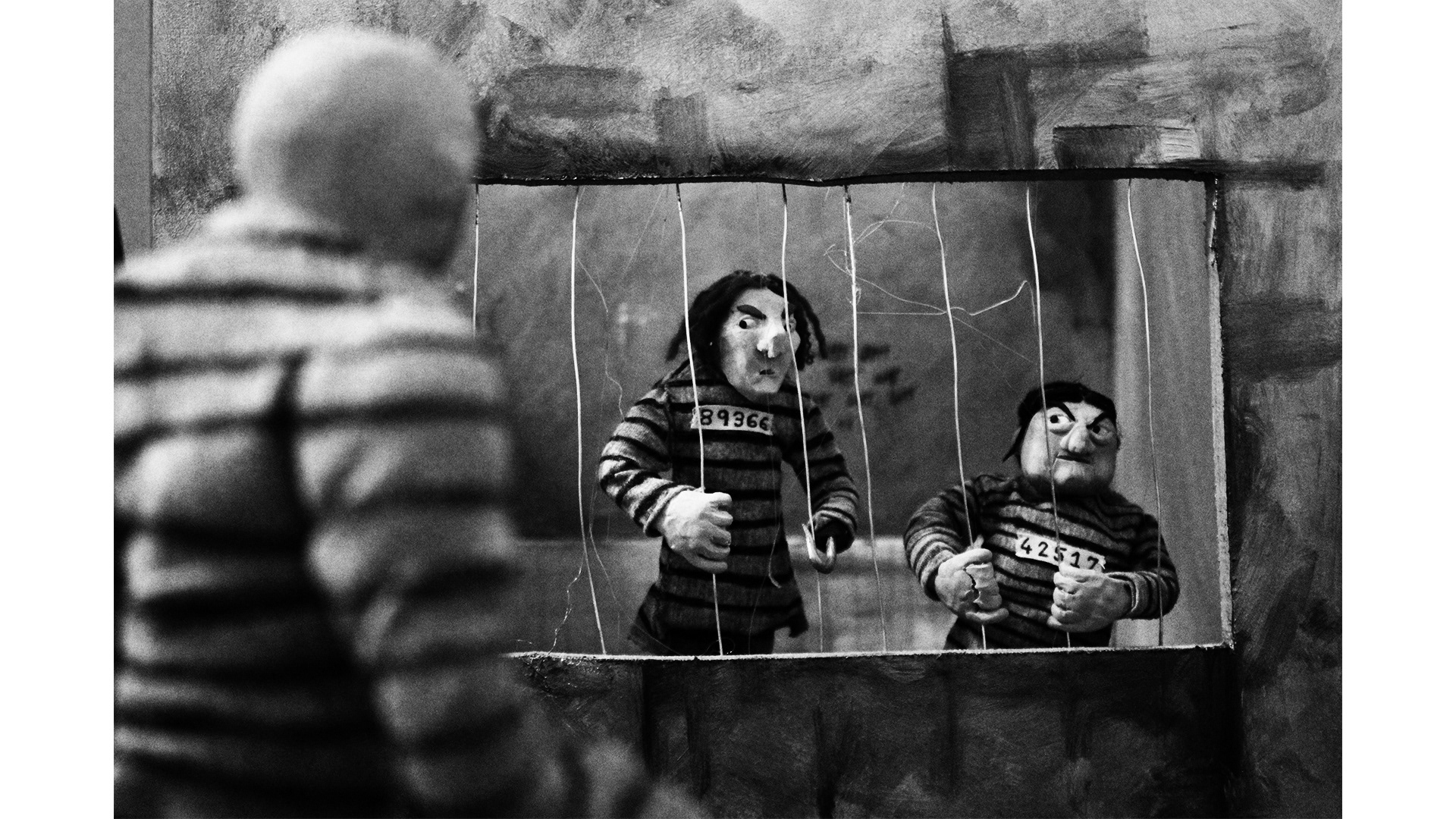
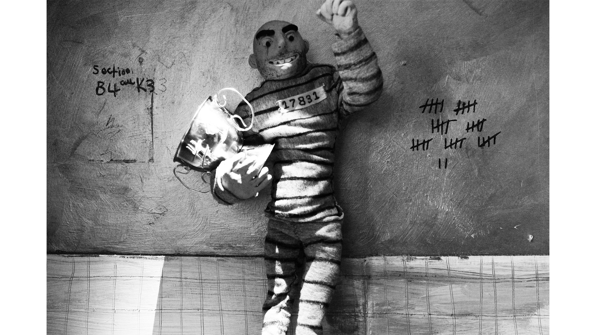
I created a few props for the animation that were very important for the overall outcome.
The Puppets
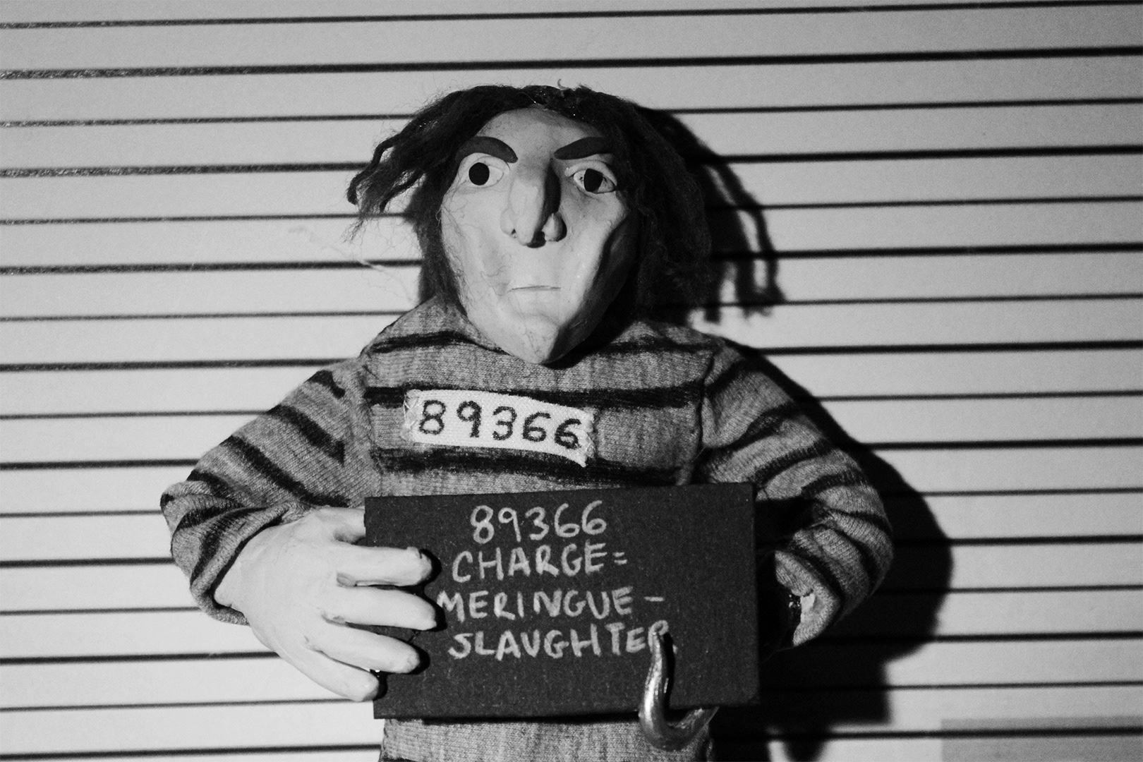
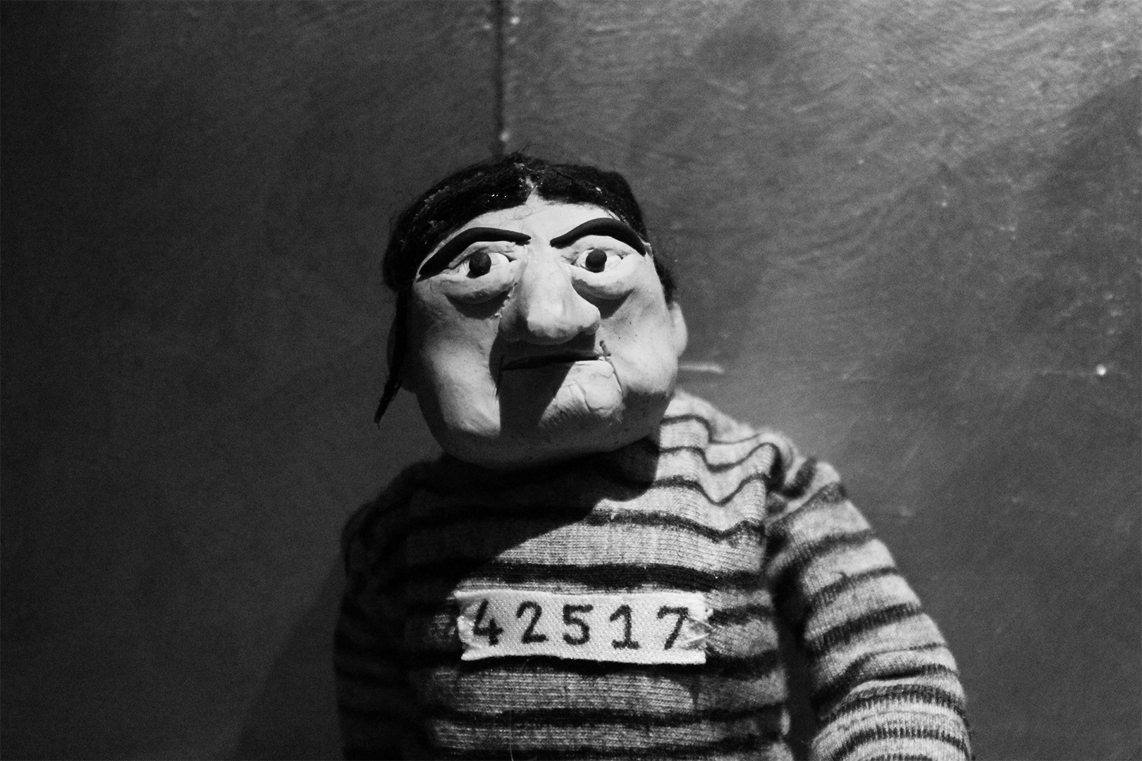
I made the puppets from Plasticine. They have a wire armature and bones made from hard plumbing material. I am really happy with the progress that I have made on the puppets. However, I am disappointed with the strength of the puppets legs and back, I didn't use thick enough wire so the weight of the plasticine on the head and arms weighed down the structure. This was very problematic when I was animating.
The clothing was hand stitched directly onto the puppets.
If I was to make them again I would make sure that I used thicker wire for the back and legs so that they are stronger. I would also consider putting screws into the feet so that they would be very still when animating and have more support. I would also consider making a rig of some kind so that I could have included more movement within the lower half of the body rather than just arms and head movements.
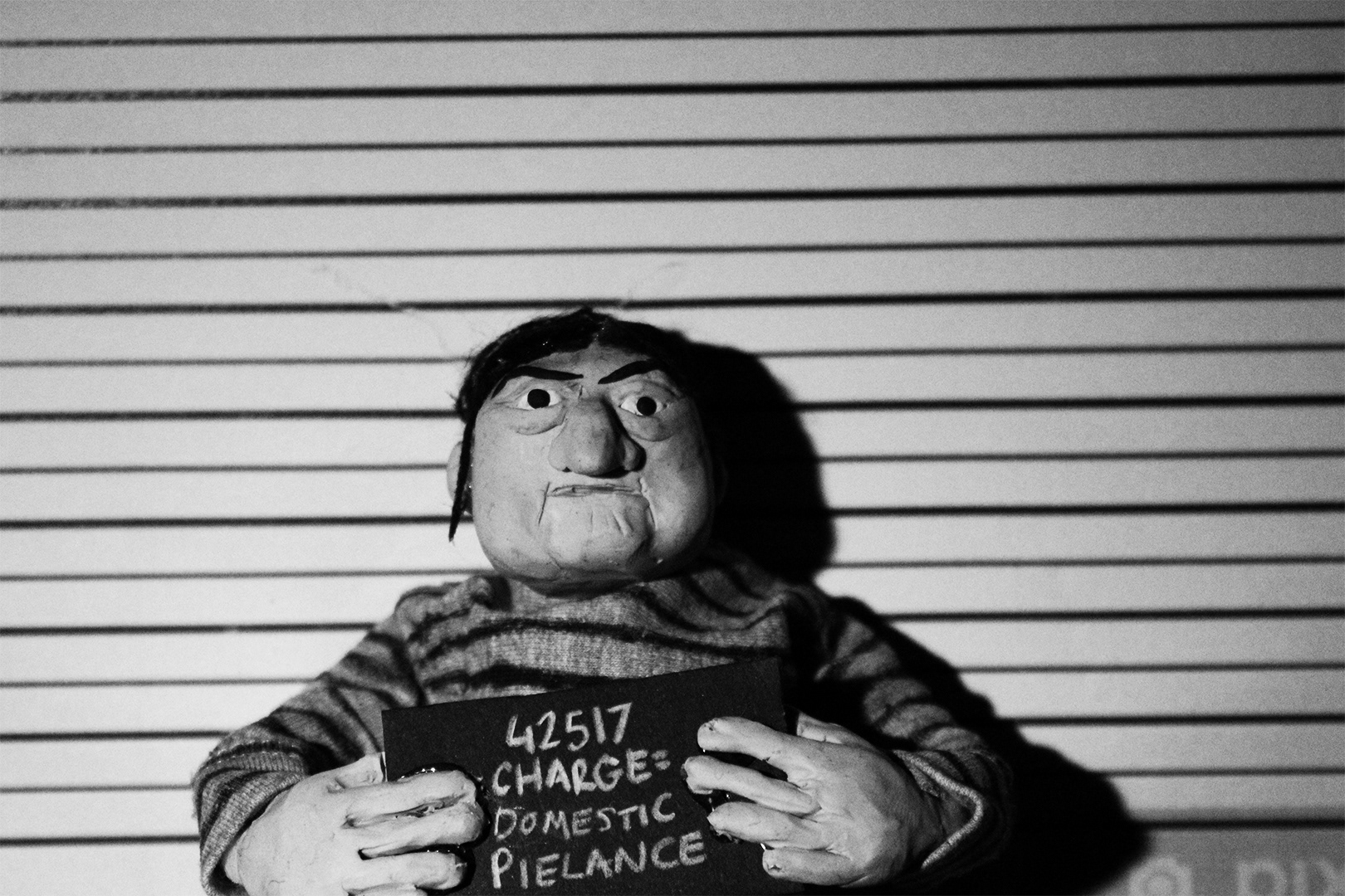
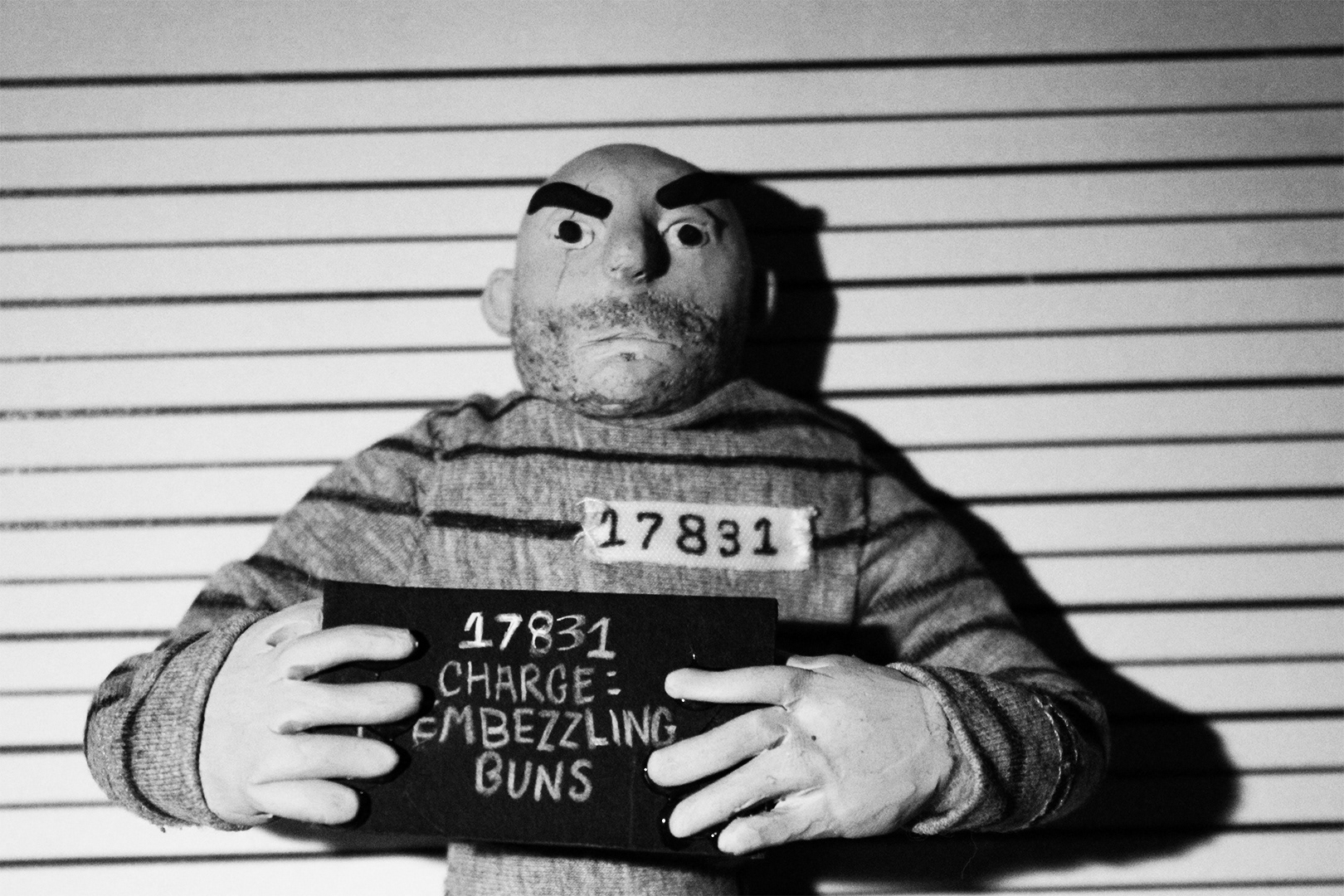
Lighting Tests
I did many tests to get the lighting exactly how I wanted it. I ended up with a light that came from the top which I dimmed down a little so that it wasn't too harsh- like in the first image shown below. I spent a lot of time to get each scene lit how I wanted. I made this animation at home so the only lights I had were torches and lamps, but I think the end result works well and has a nice vintage feel to it .
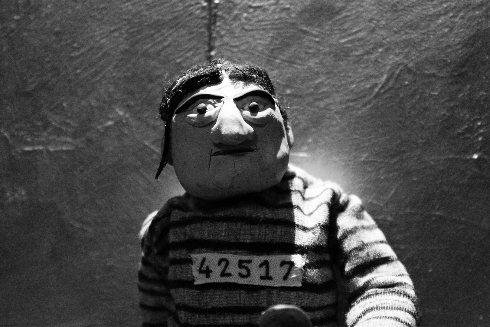
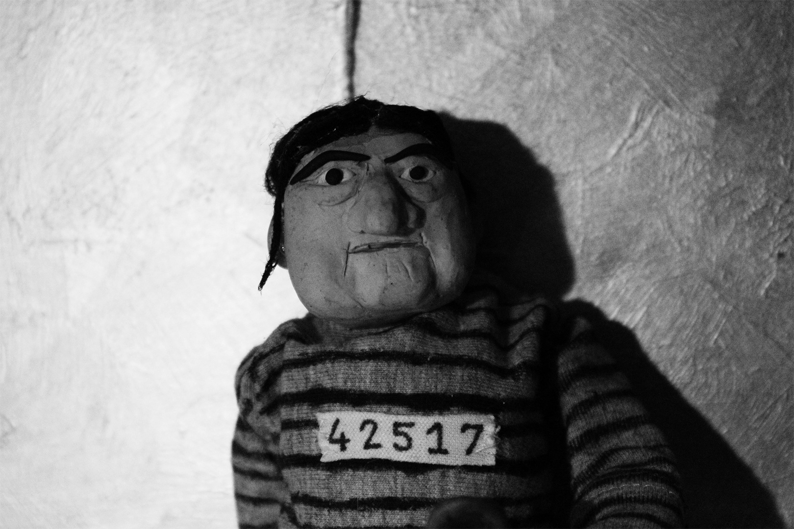
Animatic
This Animatic plans out the timings for my animation. It also includes lots of sound effects because this was very important within my animation to create tension at the start of my animation and to build up to the point in which it is revealed that they are only baking.
